The situation
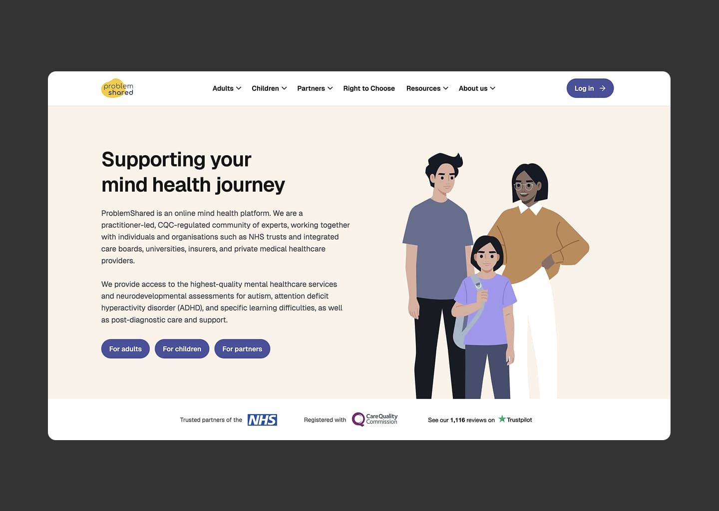
ProblemShared is a UK healthcare service for adults with ADHD, autism, and related conditions. By the time we started working together, they already had real customers, a product that did what it said on the tin, and an engineering team that knew their domain better than most clinicians. What they didn’t have was anyone whose job it was to ask whether the product was actually designed for the people using it.
That mismatch shows up in particular ways with neurodivergent users. A flow that tests fine with a typical user can fall apart for someone whose attention is fractured, whose working memory is fragile, or who is already doing the cognitive work of getting through the rest of the day. Buttons that feel obvious to the team feel like a wall to the person on the other end. The product worked. It didn’t feel like it was working for them.
The first phase — understanding before redesigning
I didn’t open Figma for the first few weeks. I went through the product the way a new user would, then went through it the way a clinician using it internally would, then sat with the team while they walked through the parts of the system I couldn’t see. The questions kept coming back to the same three: where do users get confused, which features are people actually reaching, and which screens have drifted furthest from how the rest of the product looks.
What came out of that was a list, sorted by impact, of where the design was costing the business something. Not a redesign brief. A diagnosis the team could agree with before any decisions got made.
The work
A design system the team could ship from
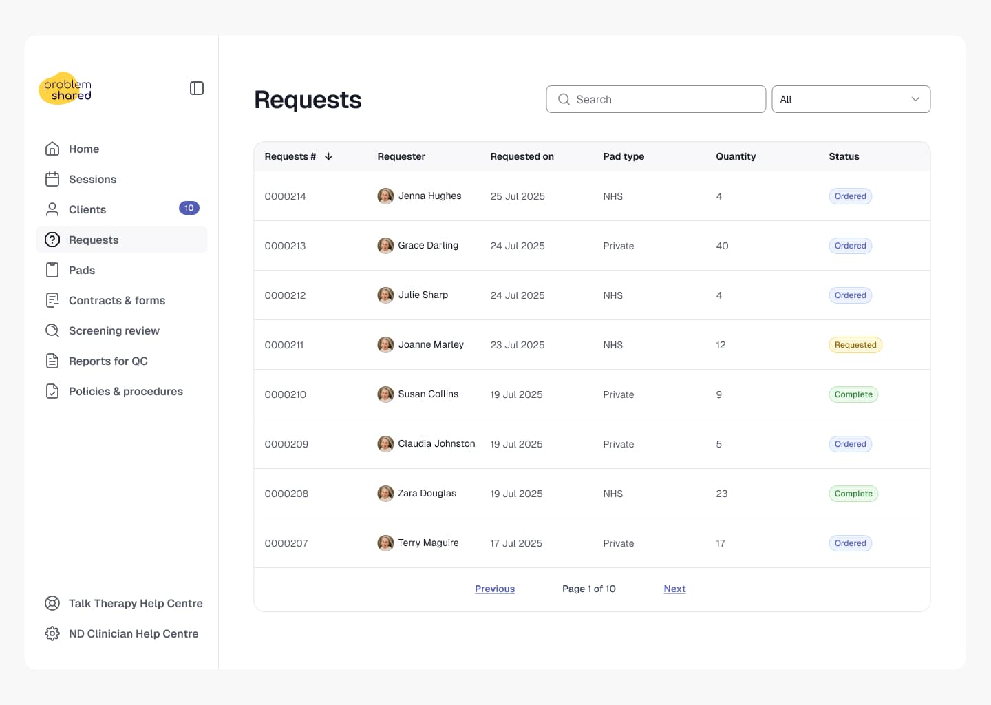
The first concrete deliverable was a design system. Not the kind that lives in a Figma library and quietly goes stale — one that the engineers could actually build from, that matched the components already in the codebase, and that gave the product team a shared vocabulary. Buttons stopped being one of seven slightly different buttons. Forms started behaving the same way across screens. The work that used to require a design conversation each time started getting decided at the system level, once.
A website the marketing team could own
The site lived inside the engineering sprints. Anything copy or layout related had to wait for an engineering ticket. We rebuilt the marketing site so the team could change copy, swap imagery, and ship pages without an engineering handoff. It freed engineering to do engineering and gave marketing the speed they needed to keep up with the rest of the business.
A product UI built for the people using it
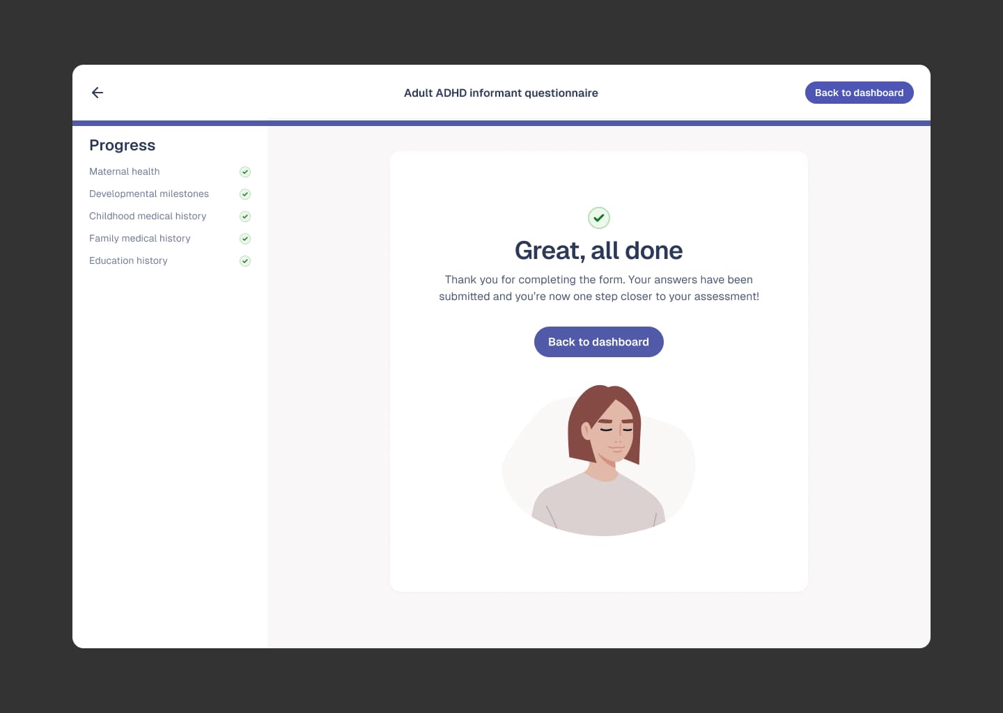
Neurodivergent-friendly design isn’t a separate aesthetic — it’s a set of choices about clarity, structure, and respecting attention. Bigger touch targets where decisions matter. Calmer interfaces. Fewer simultaneous demands on screen. Defaults set so the safest action is the easiest one. None of those choices look dramatic on a screenshot. The cumulative effect is a product that stops working against the people who need it most.
A postcode lookup that quietly replaced a worse experience
One small example of the kind of detail that gets ignored when there’s no designer in the room: a postcode-to-area lookup that replaced what was previously a frustrating text-based search. A small change. A measurable drop in how often users got stuck trying to find a service near them.
What changed
The product became easier to use for the people who need it most. Clearer structure, calmer interfaces, fewer points where users get stuck. The brand stopped looking different on every screen. The marketing site started moving at the team’s actual pace rather than waiting on engineering capacity.
But the change I’d point to as the most important is one you can’t see on a screenshot: the team started shipping design work without needing me in the room. New screens come out looking like they belong. New features get shaped around how their users actually behave, not just what the spec says. The studio’s methodology has a name for that — Depth — and it’s the part of the partnership that compounds.
“Owen doesn’t just design things — he understands why they matter. Three years in and he still treats every decision like it’s the first one.”
— Co-founder, ProblemShared
Why this kept compounding for three years
Most design relationships end before the designer really understands the problem. Briefs get written, mockups get delivered, the designer moves on to the next thing, and the team starts again with someone new. The cost of that cycle isn’t the design work — it’s the context that gets lost every time someone leaves.
The reason this engagement kept producing better work in year three than in year one is the same reason it kept being worth paying for: the depth of understanding compounds. A designer who knows your business, your users, and your engineering constraints makes faster, sharper decisions than someone still learning the basics. Those decisions add up.