The situation
ATOL is a London passive fire protection firm. The work they do is the kind of work that protects people in high-rise residential buildings — the details that get specified into a project at the start and never get attention again unless something goes wrong. The technical standard was already among the best in the city.
The problem wasn’t the work. It was the gap between the work and how the work looked from the outside. Project decisions in this market get made by developers, contractors, architects, and consultants who are filtering through dozens of firms at a time. By the time they’re reading credentials, the visual language of the firm is already doing half the talking. ATOL’s brand was telling a quieter story than its work deserved.
The cost of that gap was specific. Bids that went to firms with weaker technical credentials but more polished presentation. Enquiries that came from the wrong kind of project. A pipeline that wasn’t calibrated to the standard of work the team was capable of delivering.
The first phase — understanding the buyer
Before drafting any visual direction, I needed to understand the room ATOL was trying to walk into. Premium developers, high-end residential architects, principal contractors on listed schemes. The kinds of clients who assess a firm in two seconds and then decide whether to spend the next ten minutes reading more.
That’s the buyer the brand needed to speak to. Not in the language of generic construction marketing, and not in the language of design awards either. In the language those decision-makers already use to assess credibility: precision, restraint, evidence of technical depth, no slogans.
The work
An identity calibrated to the buyer
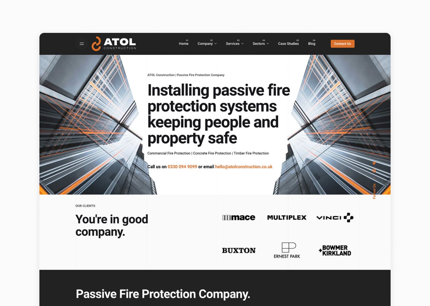
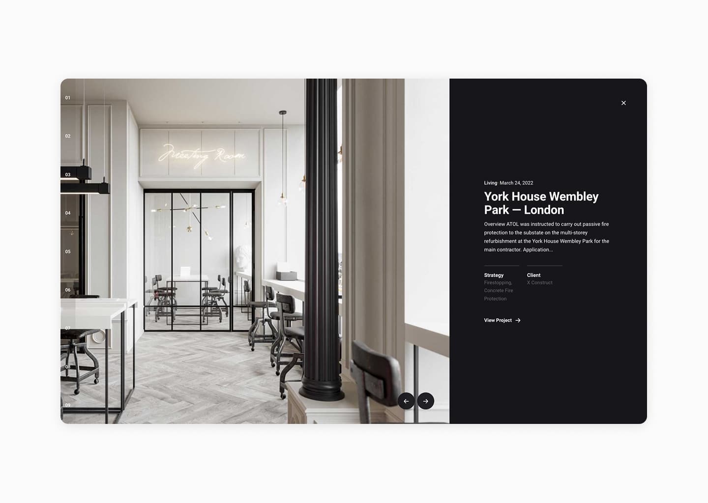
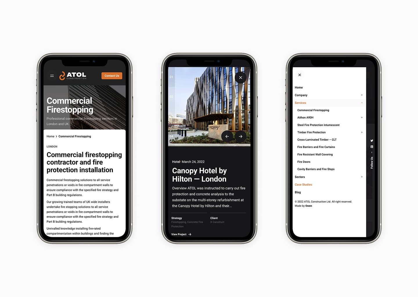
The new identity led with restraint. Typography that read as confident rather than loud. Imagery focused on completed projects rather than stock illustration. Document templates that matched what those buyers expect to see on bid materials — close to architectural rather than corporate.
The system was deliberately tight. A small set of typographic rules, a small set of layout patterns. Easy for the team to apply consistently without me in the room every time a new document went out.
A website that did the credibility work
The website rebuild was the largest single piece of the engagement. The job of the site wasn’t to convert traffic. It was to be the page that survives the two-second filter when an architect or developer is checking whether ATOL is worth a longer conversation.
That meant putting the work first. Case studies built around named projects. Photography shot on site. Technical depth surfaced where it lives — inside the project pages, not on a generic services page. The structure reflects how the buyer actually reads: project, scope, technical detail, who else was involved.
What changed
Within three months of the rebrand, ATOL was shortlisted for a contract type they hadn’t previously been considered for. Within the first year, the mix of inbound enquiries shifted. Less calibration time spent on projects that were never going to fit. More projects in the band of work the team wanted to be doing.
The technical capability didn’t change. The visibility of that capability did.
“We went from being overlooked to being shortlisted. The brand finally matches the standard of work we deliver.”
— Managing Director, ATOL Construction
Why brand work has to lead with the buyer, not the firm
A lot of brand work for specialist firms goes wrong in the same way: it tries to make the firm look distinctive instead of making it look credible. Those are not the same job. For ATOL, distinctiveness was a distraction. What mattered was building a visual system that signalled the same level of care as the technical work, in the language the buyer already uses to assess firms in this category.
The reason this approach works isn’t aesthetic taste. It’s getting the audience right and refusing to let the brand drift away from them.